Challenge
How can we enrich the analysis of fluctuations in consumption trends and their relationship with the economic landscape?
The data exists and holds valuable insights, but its current format doesn't allow that value to be fully accessed or leveraged.
Outcome
We designed and developed a comparison tool that is understandable to even audiences with no background in economics.
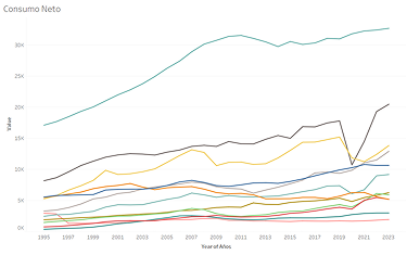
We replaced thousands of complex numerical data points with an interactive interface, enabling users to explore and interpret the information intuitively.
Introduction
This visualization was developed as an academic project in one of my post-bachelor's design courses, focused on learning how to design interactive dashboards. The process consisted of three main stages: data processing and analysis, selecting the appropriate graph type, and implementing the tool through code. The final result is more than a chart—it's a decision-making tool that transforms raw data into valuable insights for B2C business intelligence.
Research
When conceptualizing this project, we thought about who could benefit from the information.
Since the dataset involves consumer behavior, the potential audience is broad. That meant the tool had to use accessible language and offer transparency and clarity in how data is presented.
If our goal was to support decision-making, we knew users would need to compare data, not just look at it. Being able to compare trends was fundamental to the tool's effectiveness.
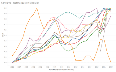
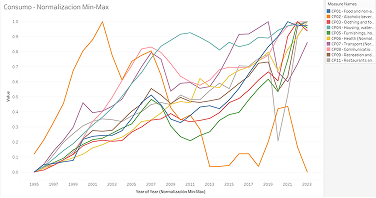
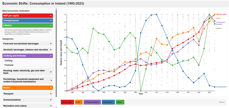
To enable this, we applied min-max normalization. This allowed us to view the fluctuations of each indicator relatively, since a 3% rise in unemployment is not the same as a 3% rise in inflation over the same period.
Prototype
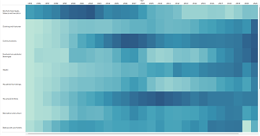
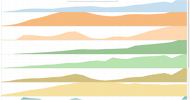
Using tools like Tableau, R, and Python, we generated four prototypes based on different visualization paradigms.
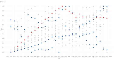
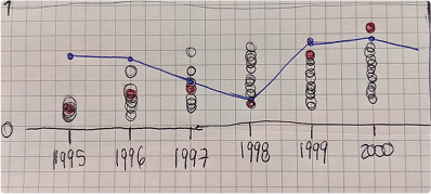
From these experiments, I created a hybrid of a scatterplot and a line graph. The line graph is easy for non-experts to understand, while the scatterplot displays trends without appearing cluttered. Combining them gave us the best of both worlds.
I coded an initial prototype with the basic structure of the tool. At this stage, AI tools (ChatGPT, Gemini, Deepseek, Claude) were key allies. We used the prototype to gather feedback from potential users—ranging from data analysis experts to fellow designers. In projects like this, it's important to get user feedback early, before investing too much time "polishing" the tool only to realize major changes are needed later.
User Feedback
We validated that the scatterplot + line graph approach was effective in allowing users to compare economic factors and consumption trends. The interface we designed was also found to be intuitive and easy to use.
However, non-expert users were confused by the concept of data normalization. The term was too technical, and the scale felt ambiguous.
Changes Based on Feedback
Since accessibility for non-experts was a key goal, we applied two strategies to address the confusion:
- Terminology Clarity: We proactively provided users with a brief explanation of what a normalized scale means.
- Comparison Toggle: Because visual comparison helps understanding, we added a toggle to switch between normalized and original data. Seeing the change in scale helps users visually grasp what normalization does—without needing complex explanations.
Final Outcome
The final product is more than a data visualization—it's a decision-making tool for B2C teams, accessible to all team members regardless of their academic background. I learned how to design intuitive interfaces for dataset exploration and how to use programming tools to turn raw data into actionable insights that support business intelligence.